
Have you ever picked up a book just because the cover “felt right”? You’re not alone. Before most of us have even read the summary or checked reviews, our brains make snap decisions and judgments about whether we want to read the book based on its cover.
In the word of books, it’s often a big no-no to pick a book by the cover. “Don’t judge a book by its cover,” they say. However, that doesn’t stop our brains from doing it. It’s psychology.
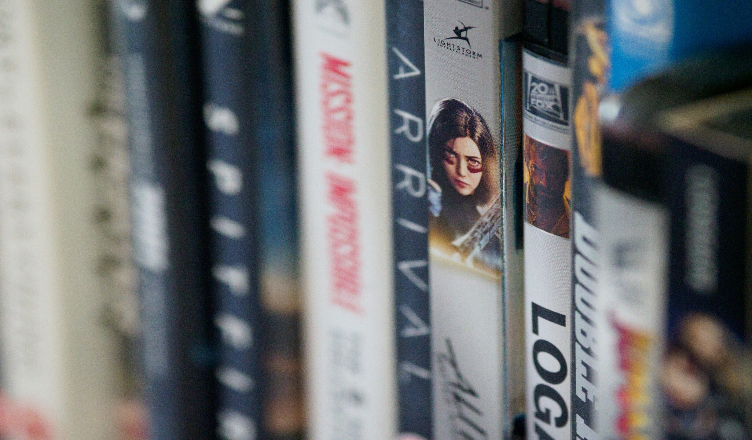
You can tell a lot from the cover of a book. A book with colourful, animated characters is often a romance. A minimalist cover is usually literary fiction. Every genre follows a pattern for the same reason. Publishers know readers will know what the book is going to be because of the cover.
First Impressions Matter
People often say that the brain processes images sixty thousand times faster than text, a claim usually linked to a 1982 study by 3M.
While that exact number isn’t proven, experts agree that our brains understand pictures much faster than words. Studies in visual psychology suggest that images may be processed anywhere from eight to over 500 times faster than text.
“I never pick up a book with real people on the front. I don’t know what it is about it. It could be the best book ever, but I won’t be drawn to it with real people on covers of books” – Noosha Yasrebi, second year Biochemistry student.
This means a book’s cover is like a first impression, it sets our expectation on what we are about to read. For example, if we take a popular book like Beach Read by Emily Henry, you expect a feel good, easy read. Whereas if you take an equally as popular book, Verity by Colleen Hoover, you are expecting a much darker and suspense driven book.
The Secret Codes of Covers
Book designers often rely on what they call, “genre codes.” They are visual cues that tell us what kind of story we are getting. These visual signals help readers immediately identify what they like. Publishers invest heavily in this kind of psychology because readers are drawn to patterns they subconsciously recognise.
“I can tell what the book is going to be about before even reading the blurb. If there is a colourful cover, I am expecting a light-hearted book” – Abby Eastwick, third year Law student.
When Covers Mislead
Now, of course, not every cover gets it right. Which can sometimes lead to disappointment for readers. The Bell Jar by Sylvia Plath is an example of this.
When it was reissued in 2013, the UK edition used a retro illustration of a woman applying makeup, making it look like light chick-lit rather than a dark, semi-autobiographical novel about mental illness. Readers were outraged. After the criticism editors returned to a more sombre, symbolic artwork that matched the books serious tone.
“You want the cover to match the story. Working in a bookshop has taught me that lots of times people face disappointment from books where the cover implies something else” – Daniel Mazz, Bookshop Worker for three years.
Book cover disappoint is real and can severely affect someone’s experiences of reading that book. A successful design should not only attract the attention of readers but also accurately depict what is inside the book.
Designing for ourselves
At UEA, we are surrounded by books every day, whether that’s in the library or online. But what would happen if we got to design the covers ourselves?
Try this: redesign the cover of your favourite book to reflect how you interpret it. Would you change the colour scheme? The title font? The imagery? Let us know…
More than just a cover
In the end, a book’s cover is more than just an advertisement. It creates the gap between the story and the reader’s imagination. The next time a book catches your eye, pause for a second. What is it really trying to say?
After all, maybe we do judge books by their covers.
Image Credit: Ella Stone


Leave a Reply